


SLU Logo Guidelines
Saint Louis University and Billiken Athletics logos are among the most recognizable expressions of our brand. These guidelines establish how to use them consistently and correctly to strengthen recognition, protect the integrity of our visual identity and help ensure that every expression of the University reinforces a strong, unified SLU brand.
For questions about the Saint Louis University Visual Identity Guide, email Matt Krob, director of design services, at matt.krob@slu.edu.
Overview
Use approved logos only
- Use only official University and Athletics marks, along with approved logo lockups for schools, colleges, divisions, departments, centers and other units.
- The creation or use of unauthorized alternate logos representing SLU or its units is prohibited.
- Use approved logo lockups as provided. Do not rearrange, combine, separate or alter their individual elements.
- The SLU logo must stand on its own and must not be incorporated into another organization's logo or used to create a new logo.
- Do not include alternate fleur-de-lis designs when representing the University.
- Separate marks may be considered for time-bound or annual events but must be approved by the Division of Marketing and Communications.
Preserve the integrity of all marks
- Always use official artwork as provided, without recreating or modifying University marks, including through AI tools.
- Maintain the original proportions when resizing. Logos should never be stretched, skewed, sheared, rotated, flipped or otherwise distorted.
- Use only approved logo colors and color variations, including inverse versions.
- Keep logos free of added graphics, words, symbols, accessories or other elements.
- Preserve the original artwork by avoiding drop shadows, outlines, filters or other visual effects.
- Keep logos fully visible and unobstructed. Text and other design elements should never overlap or cover any part of a mark.
- Preserve the approved arrangement, proportions and hierarchy of elements within each logo or lockup.
Follow Billiken-specific guidelines
- Use the official Billiken logo as provided, including its approved colors and configuration. The Billiken logo requires three colors: Blue, white and gray. Do not create unauthorized single-color or alternate-color versions.
- Do not add accessories or decorative elements, such as hats, glasses, bowties or earrings, to the official Billiken logo.
Use logos appropriately in layouts
- Maintain sufficient clear space around logos so they remain distinct from surrounding content.
- Ensure adequate contrast and legibility when placing logos over photography, colored backgrounds or other visual elements.
- Avoid unnecessary repetition of the same logo within a single layout, particularly when an approved unit lockup is already present.
- Follow applicable co-branding guidelines when presenting SLU marks alongside those of external partners, sponsors or other organizations.
These guidelines apply across print, digital, advertising, social media, merchandise, signage and other communications. When in doubt about an appropriate application, consult University Marketing and Communications before proceeding.
University Logo, Wordmarks and Lettermarks
Released in November 2015, Saint Louis University's logo is our symbol (fleur-de-lis in shield) integrated with our institution name. SLU's official logo system was designed for use (and legibility) across every touchpoint. Any variations must be approved by Marcom’s director of design services.
Logo
Lettermarks/Wordmarks

Logomark

Billiken Athletics Logo
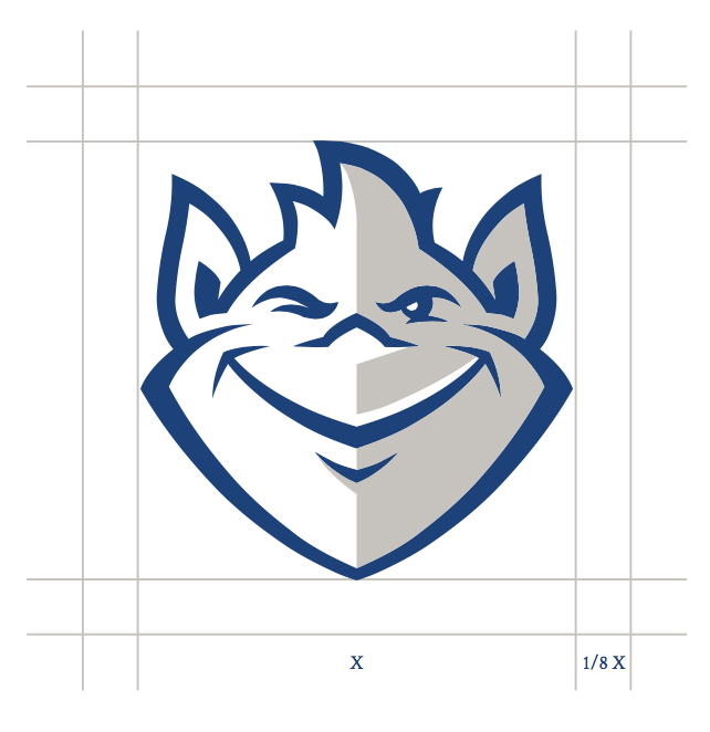
Updated in 2015, the Billiken is Saint Louis University’s official mascot. A unique good-luck figure who represents things as they ought to be, the Billiken should always be represented as shown, with no alterations or additions and always with the shading, wink and other key facial features.
The recommended clear space is 1/8th the width of the Billiken.
Logo Usage Guidelines
Logos require a minimum size to ensure maximum legibility and to keep the integrity of the University's mark intact. The primary logo may be reduced only to a minimum of 0.75".
Primary Vertical
The primary logo is the vertical centered logo.
Horizontal Variations
The two horizontal variations, center-aligned and left- aligned, can be used wherever necessary, depending on the space and medium. There are different logos that can be leveraged at specific sizes to uphold the presence of the brand. When smaller sizes are needed, wordmarks or logotypes can be utilized and, in extreme cases, the logomark/symbol alone may be used and reduced to 0.25".
Maximum legibility is also required for online usage of the logos. The minimum size requirements for all logos can be found below.
 Minimum width: 75 px or .75''
 Minimum width: 100 px of 1''
 Minimum width: 175 px or 1.75''
 Minimum width: 75 px or .75''
 Minimum width: 125 px or 1.25''
 Minimum width: 30 px or .30''
 Minimum width: 25 px or .25''
 Minimum width: 50 px or .5''
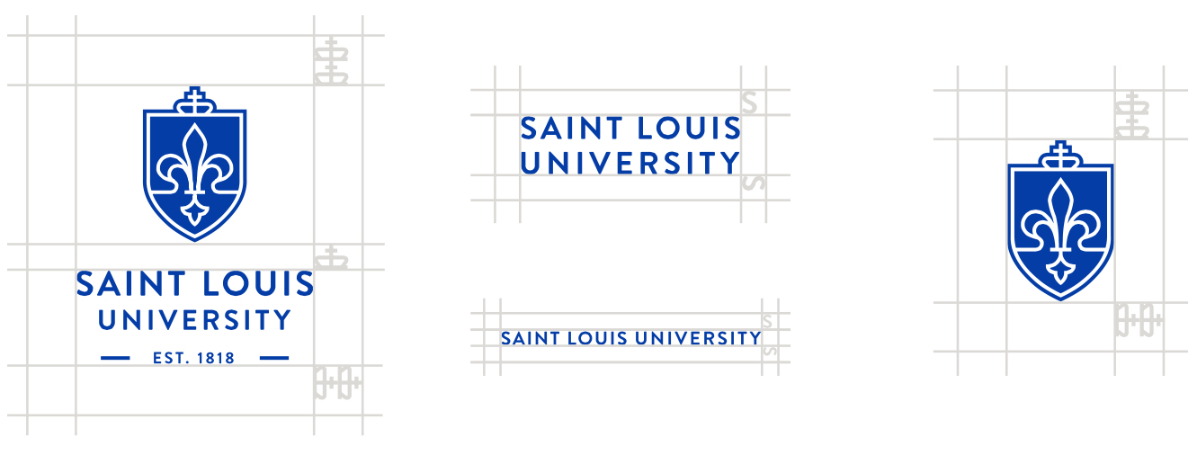
To maintain proper and maximum visibility, logos require ample space surrounding them, known as clear space. The height of the clear space for the logos and logomark correlates with twice the height of the crown. Keep this space open and clear as shown above to maintain the integrity of the logo and brand. The clear space for wordmarks or logotypes is the height of the letter "S" around.
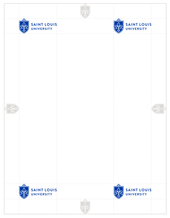
The logo should be prominently featured on all mediums and communications. The size of the logo should be appropriate to the size of the medium or media.
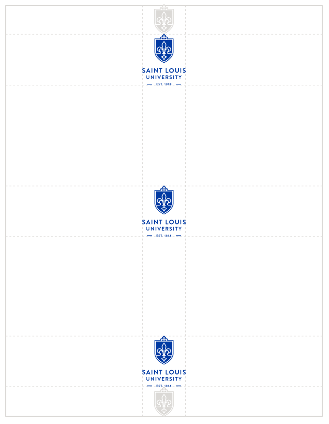
To create consistency, there are only a few locations the logo is allowed to be featured: any of the corners or centered depending on the logo, the content and what the piece is communicating. The logomark or shield should be used to create consistent margins throughout all materials as seen above. For printed materials, the logo should never be larger than 20 percent of the page. For interactive material, it entirely depends on size and legibility.
Logo Lockup System

University Logo Lockup System
The University logo lockup system was created to form consistency throughout the Saint Louis University brand. The lockups should be used across Saint Louis University's schools/colleges, divisions, departments, etc. (i.e., College of Arts and Sciences). This cohesive system strengthens our overall brand and image.
A separate lockup system exists for the centers and institutes of SLU. These entities have been identified by the deans of SLU's colleges and schools in conjunction with the Office of the Provost. When a center or institute is named, an opportunity exists to have a logo developed by Marcom within the University's centers/institutes logo lockup system. Following the implementation of this policy, only these marks will be permitted for centers and institutes. The mark provides a unique identifier and a clear and consistent visual connection to the University.
Academic Centers and Institutes Logo Lockup
All guidelines that apply to all University logos also apply to these brand-specific marks. To inquire about a lockup for your unit, email Matt Krob, director of design services, at matt.krob@slu.edu.
University Seal
The University seal is used to authenticate the highest official University documents (e.g., diplomas, presidential items and legal documents). It is used as the watermark for all official University stationery items. The University seal should never be substituted for the Saint Louis University signature or logo.
Logos for Time-bound or Annually Occurring Events
Separate logos may be considered for time-bound or annual events but must be approved by the Division of Marketing and Communications. These could include fundraising campaigns, homecoming, Fall Welcome, the bicentennial, etc. These logos should:
- Use approved University fonts (Brandon Grotesque, Crimson and Archivo Narrow), unless there is a clear strategic reason not to do so.
- Use approved University colors. New logos should be largely SLU blue and white with a secondary accent color of college church gray. Secondary color palette and any additional colors should not be utilized unless there is a clear strategic reason to do so.
A version with the University name must be created. Additional graphic elements should always work in a complementary — and not competitive — relationship with the University logo.
Contact a member of the design services team to discuss objectives, expectations and process. Time-bound logos must adhere to brand standards described on the brand guideline pages on slu.edu and appropriately represent the University.
Sub-brand Logos
Logos that are not time-bound may be considered but must be approved by the Division of Marketing and Communications. These logos should:
- Use approved University fonts (Brandon Grotesque, Crimson and Archivo Narrow), unless there is a clear strategic reason not to do so.
- Use approved University colors. New logos should largely use SLU blue and white with a secondary accent color of gray. Secondary color palette and any additional colors should not be utilized unless there is a clear strategic reason to do so.
A version with the university name must be created.
A tiered system of sub-brand logos has been developed and is described below:
- Tier I: This program or initiative is of high priority and targets a wide-reaching and largely external audience. Solution: Creation of an expansive identity system that works in conjunction with university branding. Example: The President’s Circle
- Tier II: This program is of moderate priority. Targets an external audience but one that does not contain a broad demographic crossover. Solution: Creation of a wordmark that works in-line with university branding and might contain limited graphic elements. Example: BOLD (Billikens of the Last Decade)
- Tier III: This program is low in priority. Audience is internal or a narrowly focused external group. Limited built out strategy available at time of logo request. Solution: Creation of a wordmark that works in-line with university branding but contains no graphic elements. Example: STAT (Students Today, Alumni Tomorrow)
Graphic elements should be kept to a minimum and should be proportional to the impact and importance of the group the logo is to represent. Graphic elements should always work in a complementary — and not competitive — relationship with the University logo.
Contact a member of the design services team to discuss objectives, expectations and process. Custom logos must adhere to brand standards described on the brand guideline pages on slu.edu and appropriately represent the University.
Co-branding
A small number of entities at the University operate under the auspices of, or in conjunction with, external entities such as agencies of the federal government. Those that do may be granted use of the external entity’s logo in conjunction with the University logo.
Co-branded logos follow a standardized format, with the co-branded entity or organization's icon appearing between the SLU logomark and wordmark. All co-branded logo artwork is created, managed and maintained by the Division of Marketing and Communications.
Eligibility Requirements
To receive a co-branding exemption, the following requirements must be met:
- Entity must have a permanent contractual connection establishing them as a joint entity between the University and an external entity.
- Entity must detail why the inclusion or use of a custom logo or mark will benefit their business objectives more than using the standard SLU identity system.
- Entity must receive a written recommendation from its dean or vice president.
Use Guidelines
Upon approval of a co-branding exemption, the co-branded logo may be used under the following circumstances:
- Approved co-branded logos may only be employed by those groups that meet requirements and have received approval from the Division of Marketing and Communications.
- Approved co-branded logos may be used for marketing, communications and promotional purposes.
- Approved co-branded logos can be used with or without an accompanying wordmark identifying the entity.
- Approved co-branded logos may be eligible for use on university business cards and/or letterhead. Approval and design must be coordinated through the Division of Marketing and Communications.
- In all other aspects, co-branded logos follow the same usage guidelines as standard University logo signatures.
Frequently Asked Questions
Find answers to frequently asked questions about Saint Louis University logos, branding and design guidelines.
Process
The Saint Louis University logo includes several key symbols that represent SLU's history and traditions. It also draws inspiration from our region and surrounding landscape.
- The fleur-de-lis — a reference to the city's French heritage and a Catholic symbol associated with the Holy Trinity — has been used at SLU since the 1920s.
- The cross represents SLU's Catholic identity.
- The crown and shield symbolize King St. Louis IX, namesake of the city and the University.
- The fluidity of the fleur-de-lis and the lines connecting to the fleur-de-lis petals represent the confluence of the Mississippi and Missouri Rivers in St. Louis.
Yes. Iconic graphic artist Paul Rand, who designed the IBM, ABC and UPS logos, said the best logos are distinctive, simple, useable, memorable and clear, among other qualities. Rand explains that a logo is a signature mark that identifies an entity. It is not a description of the entity. In fact, a logo's meaning comes from the quality of the institution it symbolizes, not from the graphic itself. The University logo is simplified, fully useable in digital and print platforms, unique to SLU, and presents a timeless image of Saint Louis University.
Uses
Logo
The SLU logo with the shield centered at the top and the University name centered below and paired with the text “Established 1818” is the primary mark for the University.
Variations of the logo have been created to ensure a harmonious look and allow SLU’s logo to be used easily in different sizes and in any dimension.
The two horizontal variations (center-aligned and left-aligned) can be used wherever necessary, depending on the space and medium.
A version of the primary logo omitting “Established 1818” is also available for those instances when it is necessary to run the logo at smaller sizes (anything less than .75” or 75 pixels wide).
Wordmark
In addition, wordmark and lettermark options also exist for those times when space is too small for the logo to be used, or there is a clear need to represent the University in a way other than use of one of the aforementioned logo options. For example, in designing a booklet, you plan to use the primary logo on the back cover of the communication. To avoid repetition you might decide to use the wordmark on the front cover.
Logomark
Use of the logomark (the shield without the University name included) should be limited to only those designs that will be seen on campus (and therefore readily identifiable as SLU-related) or when the design clearly identifies itself as a SLU communication. An example might be the front of a postcard that features the University wordmark on the top left corner and the logomark off to the right side of the card paired in a complementary fashion.
Please be mindful, however, that use of the logomark with other visual elements should not be executed in a way that might cause it to be misinterpreted as an alternate version of the University logo. The logomark also should not be combined with other elements to intentionally create a unique logo without advance consultation and permission from Marcom's director of design services.
The strongest, most recognizable brand for any campus unit is the Saint Louis University brand. Independent logos can diffuse and confuse the public perception of SLU. While it may seem important to differentiate your unit, the most effective way to gain recognition is to use the SLU brand and to link your unit's reputation to the power and prestige of Saint Louis University. Keep in mind that outside audiences don't focus on our organizational charts; they mostly see all units as Saint Louis University. That is an asset, not a detriment, and we can use that strength to benefit the whole University.
Yes. The marks don't replace the "Be a Billiken" student recruitment brand or identities for events that happen in a finite time frame — e.g., Homecoming and Family Weekend, fundraising campaigns, etc. Using the Saint Louis University mark on these communications gives the benefit of a SLU endorsement without disrupting their ability to create their own identities. The SLU logo should work together with the identity to create the most impact.
All marks will be expected to work within the established standards and appropriately represent the University. If you have questions regarding logo strategies, please email Matt Krob, director of design services, at matt.krob@slu.edu to talk through objectives, expectations and process.
Yes. Standard guidelines regarding the design and logo usage must be followed. Please review the list of approved University vendors found on the Business and Finance website when selecting a vendor.
Guidelines
The guidelines explain how the logos and marks are to be used, as well as how they should not be used. They specify the correct color for "SLU Blue," as well as a secondary color palette, fonts, and other useful information to help maintain brand consistency. Downloadable logos also are available online.
SLU logos and the Billiken are available in a variety of formats on the Marketing and Communications website. To avoid poor reproduction, logos should not be scanned from other printed sources or downloaded from other places on the SLU website. Standard guidelines regarding the design and logo usage must be followed.
Colleges, schools, departments, divisions and units can have an official logo lockup. The logo lockup system has been instituted to create logos that are consistent throughout the Saint Louis University brand. Logo lockups should be used across SLU’s colleges, schools, departments, divisions and units. This cohesive system strengthens the University’s overall brand and image. To request a logo lockup, please contact the director of design services.
Separate, individually designed logos are not permitted.
No. The primary logo is the shield with the fleur-de-lis and the wordmark for "Saint Louis University" and the "Est. 1818." Whenever possible, use the full logo or a logo that includes “Saint Louis University.” Use of the logomark (the shield without the University name included) should be limited to only those designs that will be seen on campus (and therefore readily identifiable as SLU-related) or when the design clearly identifies itself as a SLU communication. An example might be the front of a postcard that features the University wordmark on the top left corner and the logomark off to the right side of the card paired in a complementary fashion.
For both the University logo and Athletics marks, the official SLU colors are Pantone Matching System (PMS) 293C and white. Pantone Matching System (PMS) Cool Gray 3, a light gray, is available as an additional color. Several secondary colors have been identified and can be used sparingly. For more information, visit the colors and fonts section.
Brandon Grotesque Bold is the typeface used in the Saint Louis University logo. Brandon Grotesque is available for purchase by individual units. Check with your unit’s marketing office for more details.
Suggested complementary typefaces include the serif font Crimson and sans-serif font Archivo Narrow. Both are Google Fonts and available for free download. Recommendations on how to properly employ these fonts can be found in the online style guide.
The athletics font, Billiken Bold, was designed specifically for SLU Athletics use only and is not available commercially.
Yes. All uses of the University logo and Billiken logo should use the appropriate TM or ® marks.
Use of the seal is reserved for official documents (e.g., diplomas, transcripts, etc.) and key presidential materials. It is never a substitute for the University logo.